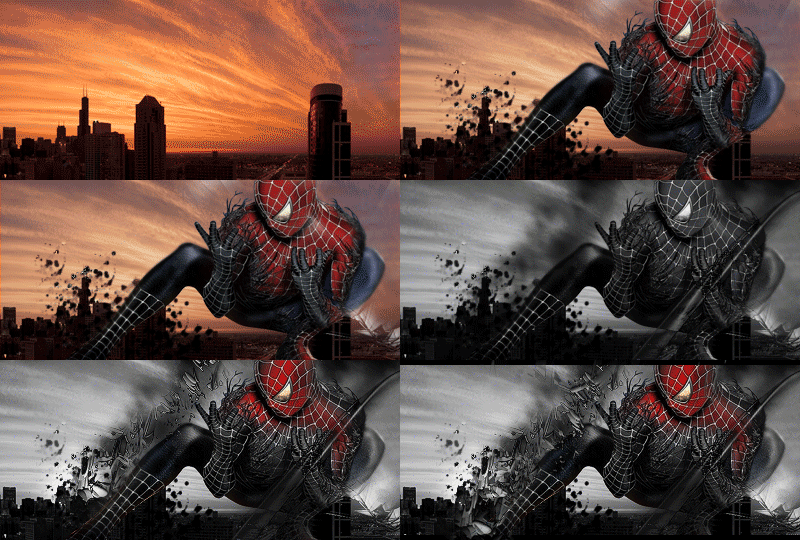
Hello you reading this,
This is my second tag in a long time.
My tag before was 'Dragonqueen' if you were interested.
As always, thank you for your time and feedback..!
Normal version.
Little overlight version.
 Thanks: 0

Hello you reading this,
This is my second tag in a long time.
My tag before was 'Dragonqueen' if you were interested.
As always, thank you for your time and feedback..!
Normal version.
Little overlight version.
Last edited by nullbyte.jp; 04-19-2012 at 03:17 PM.
Lighting is way off.


What the Hell i love it want you make a Signature for Example for me?


Allright i think Teamspeak is a Direct wayThe Normal Version is Better i think i love it thanks for Sharing


verry nice maby if the darks were darker it may look even better ?

looks pretty good...
[SIGPIC][/SIGPIC]
there is no one set focal point lay off of the blurring emphasize working on overall composition. C4D's are okay but honestly the image looks like a sticker. It needs to have depth the way you create depth is by more layers putting a background with C-4 D two renders and some fractals is not the way to do it. Try making your signatures,have one focal point as I look at this picture, the red the blue and the white are all focal points, which is very unnatural. I even see some fractals which is fine, but C4d when done tastefully. Looks awesome but when it is over done it just hides imperfections and sticks out like a sore thumb. The blurring really kills it for me because it lacks in depth blurring. If used once again tastefully and not overdone. Will work. Use the burn and Dodge tool to create depth. Also, more layers to create the vision of it looking deeper in depth so it does not look like a sticker. The more practice, the better you will get.here's a very simple piece that shows the re-creation of depth and focal.
this piece was made well over two years ago. It is already done and animated. Just to show the re-creation of depth and a focal
this is 27 layers only the entire signature was 54 layers
this does not show gradient maps-selective color-curves-photo filters-levels-vibrance strictly just C4D renders some smudging clipping masks and a render. Hope this helps you. Another great way to create depth is on your last layer apply image then added black and white gradient map and lower the opacity. That is great for creating more depth. It darkens the out sides of your work . Maybe give it a shot sometime also sharpen filters and displacement maps do signatures wonders.what this does is let you take another image for instance another signature that you have made in it displaces. On top of your current image then you can use your eraser tool and make it look the way that you want. It takes a little bit to get used to but it works awesome. Also, the use of high pass filters work phenomenal as well also use the sharpened image trick at the end of your creations. Then use your eraser tool to erase the sections that are overbearing and look like fuzzy. It helps greatly brings up detail. Please do not take this the wrong way. This is just constructive criticism. Nothing more. Good luck to you


looks good dark